Web Insights
Responsive Design vs Traditional Layout for Online Courses
Online learning has changed dramatically over the last few years. Students are no longer sitting at desktops for hours to complete training modules or coursework. They are learning on phones during commutes, on tablets at home, and on laptops between meetings.
That shift has made responsive eLearning design more important than ever.
Educational institutions, training companies, and businesses creating digital courses must now decide whether a responsive eLearning approach is better than a traditional fixed layout. The answer can affect user engagement, completion rates, mobile usability, and even conversions.
If your online course still relies on old desktop-first layouts, you may already be losing students.
So which option is better in 2026?
What Is Responsive for eLearning Design?
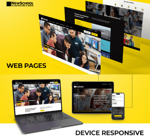
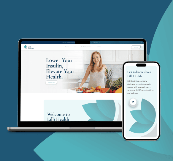
Responsive eLearning design means that your course content automatically adjusts to fit different screen sizes and devices. Whether a student is using a mobile phone, tablet, laptop, or desktop computer, responsive eLearning ensures that text, images, videos, quizzes, and menus adapt correctly.
Modern responsive learning experiences are designed to provide the same quality across every device. Traditional layouts, on the other hand, are usually built for a single screen size. This often creates problems when users try to access content on smaller devices.
That is why more organizations are now investing in responsive eLearning authoring tools and flexible responsive eLearning templates.
Why Traditional Layouts No Longer Work Well?
Traditional course layouts were originally created for desktop learning. They often use fixed widths, large images, and rigid content sections. While these layouts may still work on desktop screens, they create challenges on mobile devices.
Common problems with traditional layouts include:
- Text that becomes too small to read
- Images that do not scale properly
- Navigation menus that are difficult to use
- Quizzes that break on mobile screens
- Slow loading times
- Higher bounce rates
Imagine opening an online course on your phone and needing to zoom in just to read a paragraph. Most users will leave before they finish the lesson. That is why responsive eLearning design is now considered essential for modern learning platforms.
Benefits of Responsive eLearning for Online Courses
The biggest advantage of responsive eLearning is accessibility. Students can access courses from anywhere, on any device, without sacrificing quality. Responsive learning also improves user experience, which can directly impact completion rates and student satisfaction.
Some of the biggest benefits include:
- Better Mobile Experience: A responsive eLearning layout automatically adjusts to smaller screens, making it easier to navigate lessons, videos, and quizzes.
- Higher Engagement Rates: Students are more likely to continue learning when the content is easy to use and visually appealing.
- Faster Course Completion: When learners can switch between devices without losing functionality, they are more likely to finish the course.
- Improved SEO and Visibility: Search engines prioritize mobile-friendly websites and learning platforms. Responsive learning experiences can improve search rankings and organic traffic.
- Lower Development Costs: Instead of creating separate desktop and mobile versions, organizations can use one responsive elearning design for all devices.
The Role of Responsive eLearning Authoring Tools
Modern responsive elearning authoring tools make it easier to create courses that work across multiple devices. These tools allow course creators to build content once and publish it everywhere.
Popular elearning authoring tools responsive design platforms often include:
- Drag and drop content builders
- Mobile previews
- Interactive quiz support
- Video embedding
- Responsive elearning templates
- Flexible screen layouts
With responsive elearning authoring tools, businesses can reduce design time while creating better user experiences. This is especially useful for training teams that need to create multiple courses quickly.
Why Templates Matter on Online Course Design?
Creating a course from scratch can be time-consuming. That is why many organizations use a strong online course template or training module template. Templates help standardize the course experience while saving time. A good online course design template ensures that lessons remain visually consistent, organized, and easy to navigate.
The best responsive eLearning templates often include:
- Lesson overview sections
- Progress tracking areas
- Interactive quiz pages
- Video content layouts
- Assignment sections
- Downloadable resources
Using a course design template can also make it easier to scale course production. If you are creating multiple programs, a template for online course design helps maintain quality across every course.
What Should Be Included in an Online Course Structure Template?
A strong online course structure template should organize content in a logical and user-friendly way. Students should always know where they are, what they need to complete next, and how far they have progressed.
A typical online course outline template may include:
- Course introduction
- Learning objectives
- Lesson modules
- Interactive quizzes
- Downloadable resources
- Final assessment
- Certificate section
A well-planned online course template can improve the learner experience and reduce confusion. When combined with responsive learning principles, it creates a course that feels modern, easy to use, and professional.
Responsive Design vs Traditional Layout Which One Wins
When comparing responsive eLearning with traditional layouts, the winner is clear. Responsive eLearning design provides better usability, stronger engagement, improved mobile performance, and more flexibility.
Traditional layouts may still work for some desktop-only environments, but they no longer meet the expectations of modern learners. Students want convenience. They want to start a lesson on a laptop and continue it later on the phone. That is only possible with responsive e-learning.
If your course platform is still relying on outdated desktop layouts, now is the right time to rethink your strategy.
Ready to Improve Your Online Courses?
The future of online learning is mobile, flexible, and user focused. Investing in responsive elearning templates, modern responsive elearning authoring tools, and a strong online course structure template can help your organization create better learning experiences.
At Agency Partner Interactive, we help educational organizations, training companies, and businesses create responsive learning platforms that engage users and drive results. Whether you need a new online course design template, a better training module template, or a complete redesign of your learning platform, our team can help.
FAQs
1. Why is responsive elearning design important for online courses?
Responsive elearning design is important because students use multiple devices to access learning content. A responsive layout ensures that lessons, quizzes, videos, and resources display properly on phones, tablets, laptops, and desktops without reducing usability.
2. What are responsive elearning authoring tools?
Responsive elearning authoring tools are platforms that help course creators build online learning content that automatically adjusts to different screen sizes. These tools make it easier to create mobile-friendly courses without building separate versions for each device.
3. What is the difference between responsive learning and traditional learning layouts?
Responsive learning adjusts to the user’s screen size and device, while traditional layouts are fixed and often designed for desktops only. Responsive elearning provides a better user experience, especially for mobile learners.
4. What should an online course outline template include?
An online course outline template should include course objectives, lesson modules, assessments, quizzes, downloadable materials, and completion of milestones. A strong structure helps learners stay organized and improves course completion rates.
5. Are responsive elearning templates worth using?
Yes, responsive elearning templates save time, improve consistency, and create a better experience for learners. They allow businesses and educational institutions to build courses faster while maintaining professional design standards.
6. How can a course design template improve learner engagement?
A course design template improves learner engagement by organizing content clearly, making navigation easier, and ensuring that lessons are visually appealing. When learners can easily understand the course flow, they are more likely to stay engaged and complete the program.


